June 2026
Syft is a writing tool that eliminates the constant tab switching that breaks a writer's flow. Built for Google Docs, it scans your draft as you type, flags claims and quotes that need backup, and surfaces verified citations inline accept, swap, or dismiss with a click. No more hunting for sources means up to 50% less time spent writing, with trustworthy, well-cited work every time. Syft is currently in private preview, available as a Google Docs extension.
Figma
Project Details
Cladue


Loveable

Github
Expertise
User testing
UX design and research
Web design
Project Details
Client: SyftAi, a predictive AI extension for when you write research tools and reports
Role: UX/UI Designer
Timeframe: June - Present
Challenge
How might we improve the visual design of UI elements to make the experience more enjoyable and intuitive for users?
Heuristic evaluation
| Issue | What Can Be Improved |
|---|---|
| Footer "Terms" link points to "/" (homepage) instead of a real page | Build an actual Terms page, or remove the link until one exists |
| "dev" login link visible in main nav to all visitors | Hide it behind a query param/subdomain, or remove from public nav |
| No privacy/data-handling explanation, despite reading users' Docs content | Add a short "How we handle your data" section or FAQ before the install ask |
| "Privacy" page exists but "Terms" doesn't | Add the missing page for consistency and credibility |
| No third-party proof (testimonials, press, badges) | Add social proof — quotes, logos, security/compliance mentions once available |
| No visible confirmation message after waitlist submission | Add a clear success state/copy ("You're on the list!") |
| No visible email validation or error messaging on the form | Add inline validation with clear error text |
| No indication of duplicate-submission handling | Add a friendly message for repeat sign-ups |
| No FAQ or help/support contact anywhere | Add a basic FAQ or support email/link |
| No static sample of an actual cited suggestion | Show a real example (screenshot or inline mock) alongside the video |
| No pricing/availability info beyond "private preview" | Clarify expected pricing model or student-only status |
| No social proof of waitlist traction | Add a counter or short stat ("Join 500+ writers") if numbers support it |
| Only 3 pages total (no Blog, Changelog, About/Team) | Add at least an About/Team page to build credibility |
| Single CTA everywhere ("Join waitlist") | Add a lower-commitment secondary action (e.g., "See example output") |
| Repetitive copy across Home/Product/Mission headers and meta descriptions | Tailor messaging per page instead of reusing near-identical phrasing |
| Product page lists features but doesn't show citation format/appearance | Include a visual example of what a citation actually looks like inline |
| Mobile responsiveness of hotkey demo/videos untested | Test and confirm on mobile viewports |
| Keyboard-only accessibility of Tab/↓/Esc demo untested | Test with keyboard-only navigation and screen readers |
| Actual form validation/submit behavior untested | Run a live test of the waitlist form end-to-end |
Changes
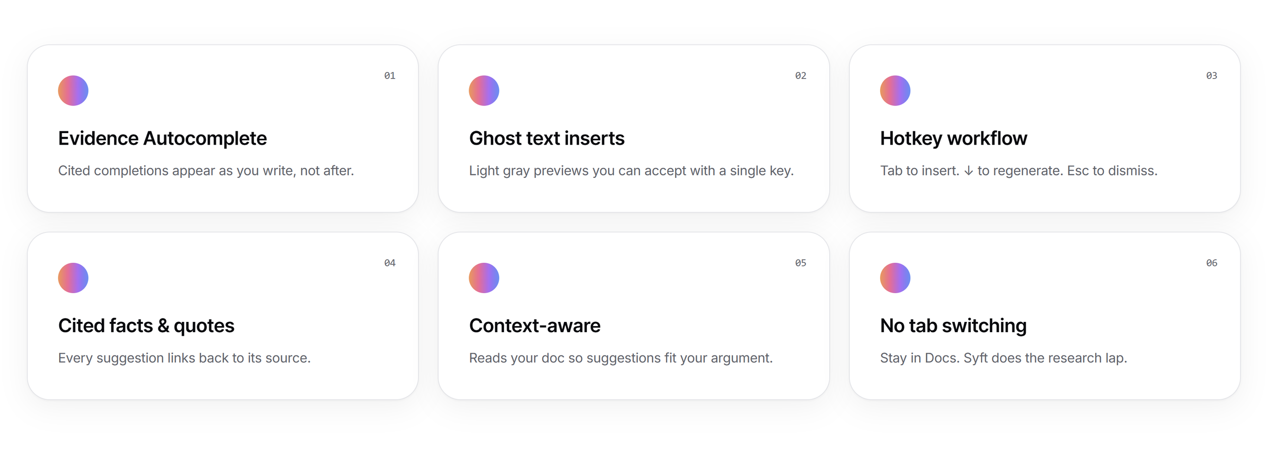
Designed the platform's logo using Lovable and Claude, with the goal of giving users an immediate, visual sense of the extension's core features and tools. The intent was to make the value proposition clear at a glance before someone even installs it so they know what they're getting.
Before
After
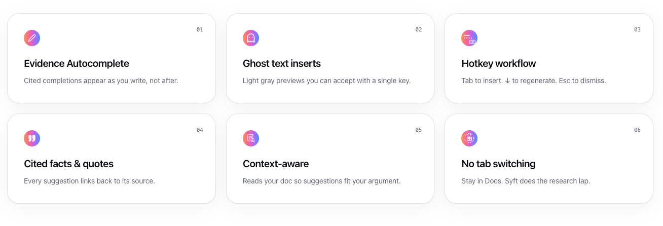
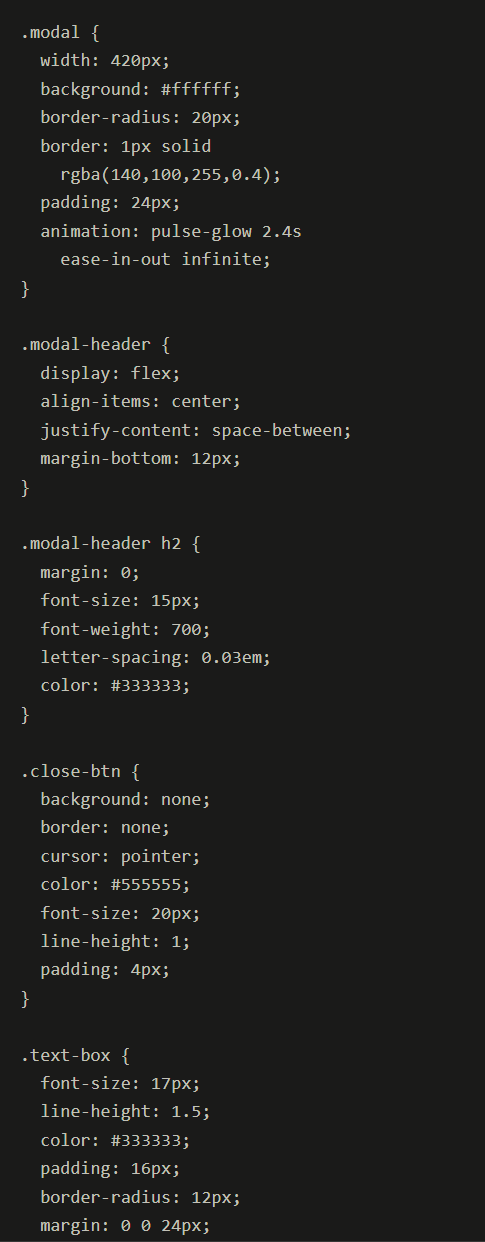
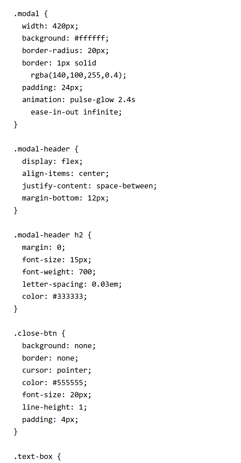
I used Claude Code to convert the Figma designs into production CSS and wire it into the product, turning design specs into working UI without the manual back-and-forth.
Results
The pulse-glow gives feedback that something changed (new content appeared), which orients attention
But there's no state feedback after the user acts clicking Replace or Copy just... happens, with nothing confirming it. In a real product, that's the difference between a user trusting the tool and a user clicking twice because they weren't sure it worked
Faster comprehension — color-coded "Original" vs. "Refined" blocks let users compare states at a glance, without reading labels.
Clear default action — the solid purple "Replace" button, positioned first, created an unambiguous next step among three choices.
Reduced decision fatigue — narrowing the flow to three specific actions (Replace, Copy, Close) avoided an open-ended editing experience.
Purposeful motion — the pulse-glow signaled new content was ready for review, not just decoration.