Amazon Prime Video
Usability Evaluation April - May 2025
Change Spacing and consistent “See More” tabs
Check out Layout
High-fidelity mockups showcasing recommended UI improvements across microcopy, spacing, filters, and navigation are designed to create a familiar, intuitive shopping experience for everyday users.
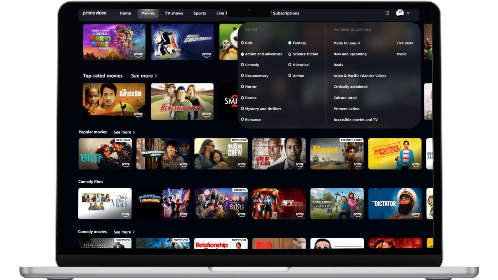
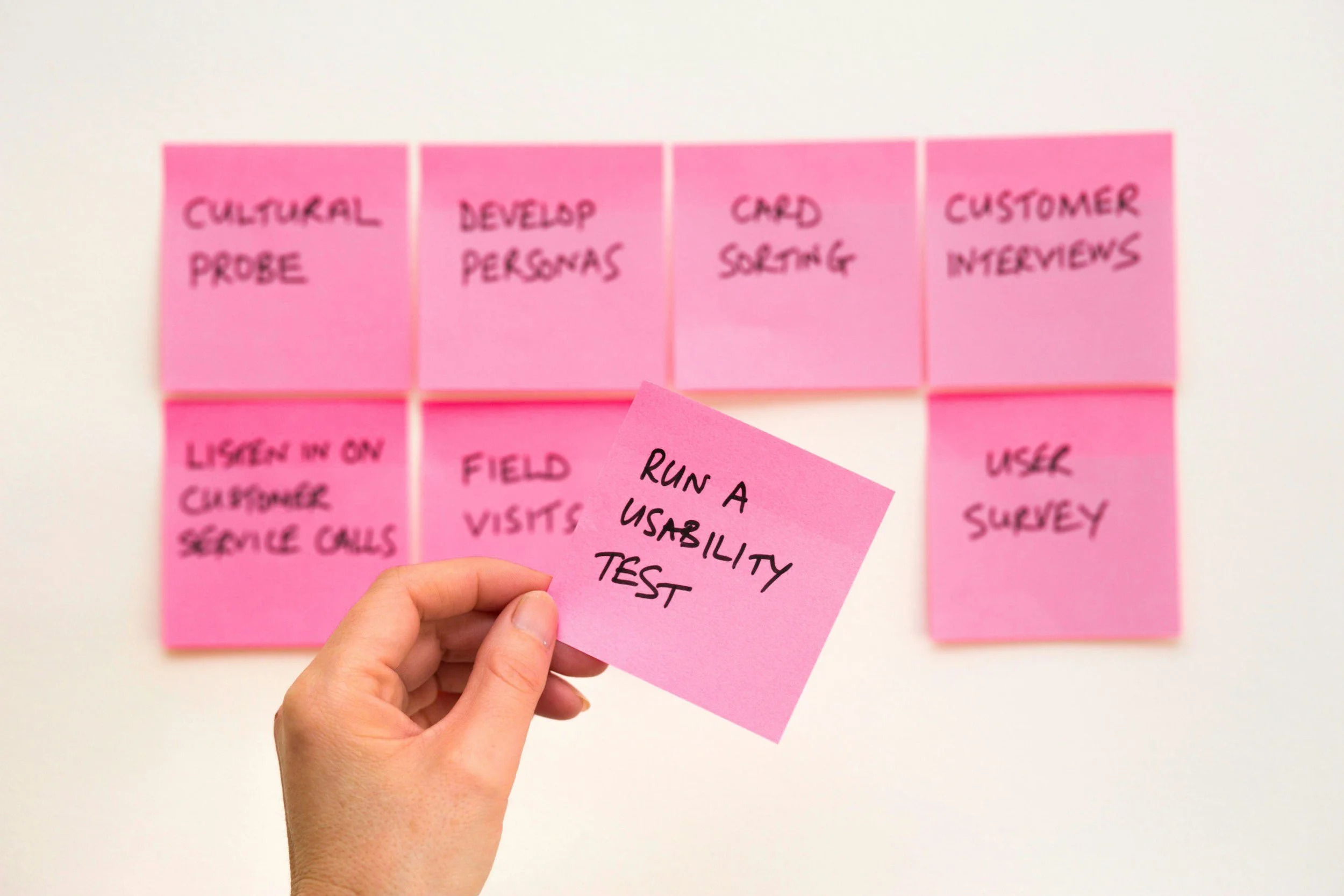
Add a Filter Menu Tab
Abstract
A usability evaluation of Amazon Prime Video was conducted to assess the app's overall usability and identify areas for improvement to enhance user satisfaction. This evaluation involved a heuristic analysis to uncover interface pain points, followed by usability testing with participants to gain deeper insights into user challenges. The study revealed key usability issues, and based on these findings, actionable recommendations were proposed to make the platform more intuitive and accessible for users of all ages. In total, ten usability issues were identified, each of which led to a corresponding recommendation aimed at improving the overall user experience of the platform.
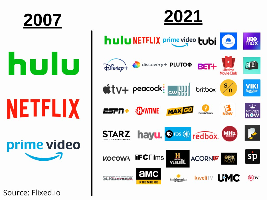
Today, there are over 200 video streaming platforms, of which the most popular are Netflix, Amazon Prime Video, and Disney+
Though Amazon Prime Video is a popular platform, there are many areas where usability can be improved upon.
This project identified usability improvements for the Prime Video website by conducting a heuristic evaluation and usability testing
Ten areas for improvement on the interface were identified, and recommendations were provided to improve the user experience.
Methods
Heuristic Evaluation:
First, a heuristic evaluation was conducted using Jakob Nielsen’s 10 Usability heuristics for user interface design. The entire website was reviewed to identify design issues and violations of usability. Visual elements were also assessed since they are a critical aspect of streaming platforms that can impact user satisfaction.
Usability testing:
Then, usability testing with 5 participants ranging from ages 21-60 was conducted. Users were asked to complete the task of renting a non-Prime movie, since the heuristic evaluation indicated this to be an area of difficulty. While completing the task, users were asked to think out loud. This method helped us better understand how users interact with the website and what aspects of the task may be difficult for them. They were also interviewed after the task to better understand their experience.
Reseults
Heuristic Evaluations
The heuristic evaluation identified several violations and areas for improvement. However, the most significant violations were related to the visibility of system status and recognition rather than recall. The website does not make it clear to users what is included with Prime and what requires users to make a purchase. Additionally, the search and filter functions are ineffective, requiring users to recall a lot of information.
Match Between System and Real World (Unclear what is included)
Issue: It is unclear what media is included in Prime and what needs to be purchased. Items included with Prime have a small Prime symbol in the lower right, while those that need to be purchased have a small yellow bag icon on the lower left. These icons are in different locations and have different appearances, making their meanings unclear to the users. (Fig. 1)
Figure 1. (Home Page free and Buy Movies)
Consistency and Standards (Rent/buy options lack a separate page)
Issue: There is a constant mix of Rent/ Buy context with free Prime content without a clear separation between the two, making it hard for users to know what they have.
Recognition Rather than Recall (Hard to find genre filter)
The icon used for the genre menu is unclear, making it difficult for users to recognize its function. Additionally, there is no filter option when you are in the genre tab. (Fig. 2)
User control and freedom (Clicking a related movie opens a new page)
When users view franchise movies, they are taken to a separate page, making it difficult to return. They must switch tabs to go back to their previous screen.
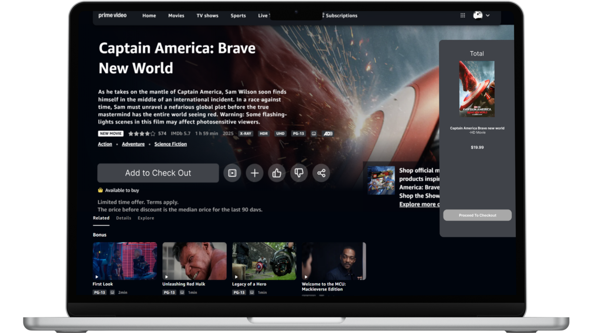
Error Prevention (No clear confirmation of purchase)
It is unclear when you purchase a movie, there is a small notice saying that continuing means the movie will be purchased, but there is no clear button that says buy/rent. Also, there is no confirmation to prevent a user from making an error. (Fig. 3)
Flexibility and Efficiency of Use (No Filter Options)
There is no Filter option on the genre tab, which makes it hard for users to be able to filter and search for what they want. Instead, they can only pick a genre and have to scroll through a lot of movies.
Consistency and Standards (Checkout page is Inconsistent)
When purchasing or renting media, the checkout page is different than the checkout page when purchasing other products from Amazon. This makes it confusing for users since they are expecting it to be consistent across the website.
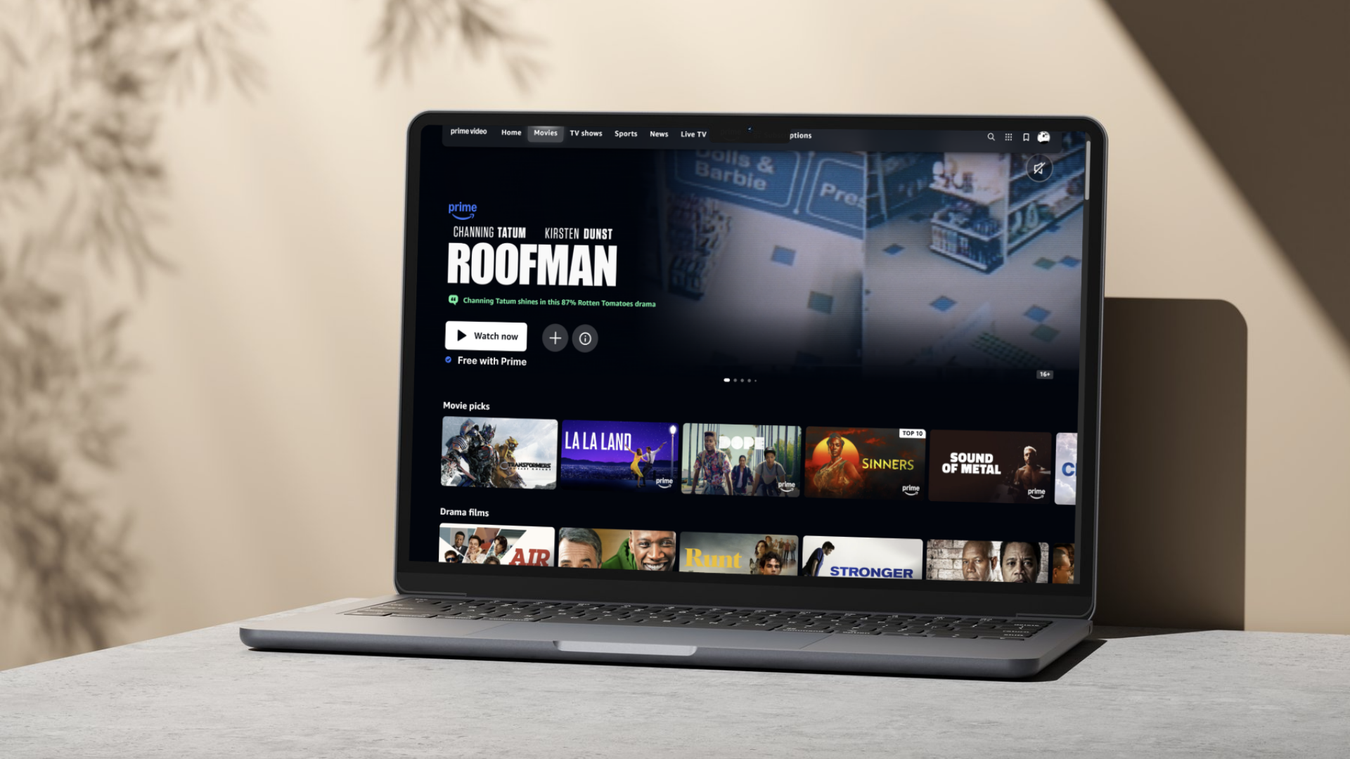
Aesthetic and Minimalist Design (Overwhelming homepage)
The homepage has too many visually similar elements, which can overwhelm the user at first glance. The homepage is not glanceable, and the labeling of the rows is unclear and confusing.(fig. 4)
Aesthetic and Minimalist Design (Large distracting icons)
When you click on the movie, the icon sizes are massive and jump out at the user, which may visually confuse the user about what to see first. (fig. 5)
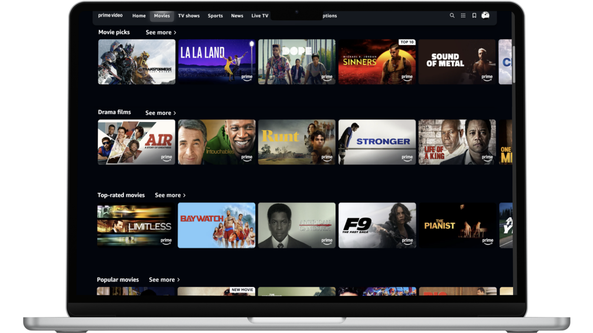
Flexibility and Efficiency of Use (Information is not on one page)
When trying to look at the cast and the description of the movie, users have to scroll up and down since the information is not in one location. This may make it annoying for users to find the information they want quickly. (fig. 6)
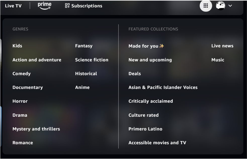
Figure 2. (Genre and Filter Tab)
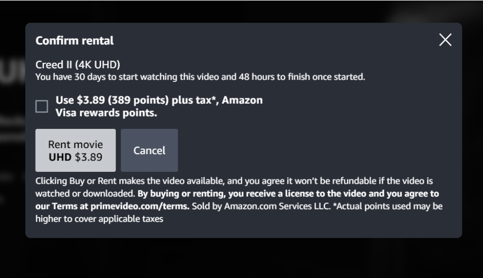
Figure 3. (Purchase Checkout Page)
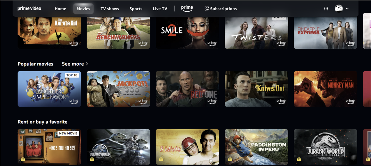
Figure 4. (Homepage List)
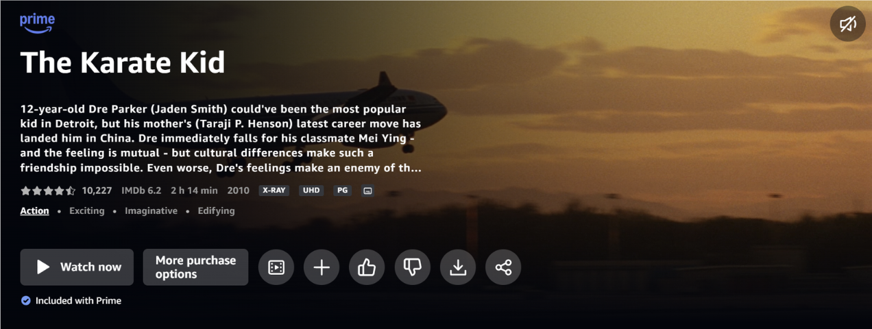
Figure 5. (Trailer, watchlist, Etc. Icon size)
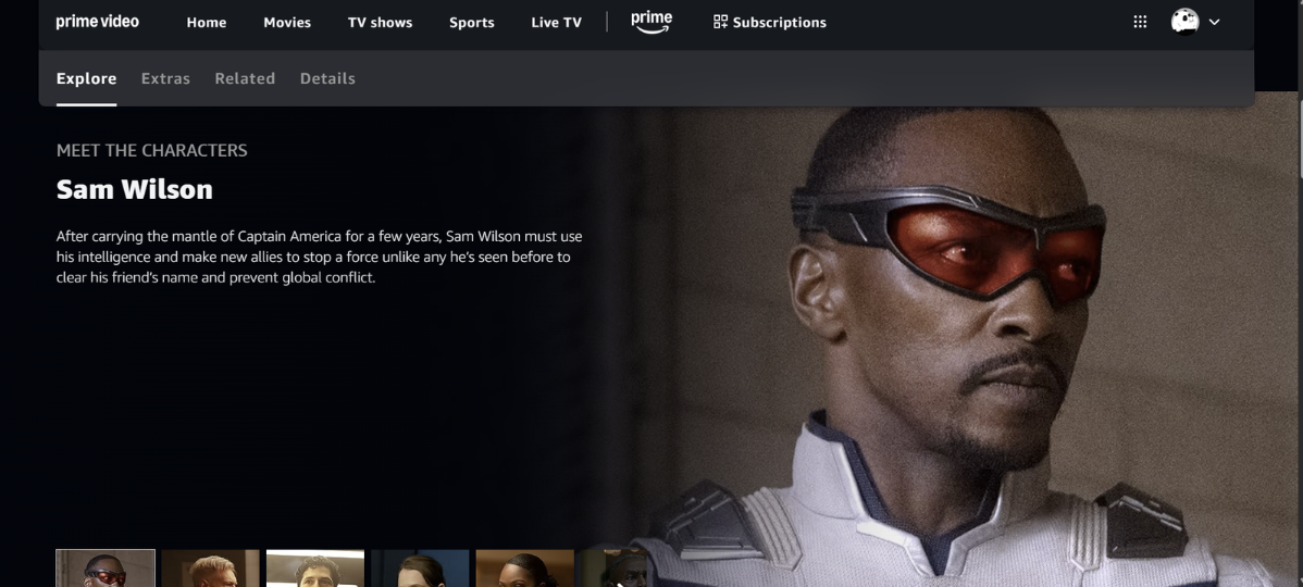
Figure 6. (Information Page)
Usability Testing
The task was to find a movie that is not included with Prime and see how much it costs to rent or buy. Five participants between the ages of 21-60 were asked to complete the task to capture the usability of different user groups. Participants were timed to understand how long this task would take. On average, it took users 7.32 minutes, indicating that this was a difficult task for users.
The usability testing revealed that it was hard for users to know when they got to the checkout menu, since it did not look like what they expected it to. The UI was different than the rest of the Amazon website. Users expected it to have the same checkout pull tab element they are used to. Also, the labeling on the page made it hard for users to know if they would be able to confirm their purchase, and it was unclear to them at what step in the process it would occur. Not understanding the labelling of buttons increased the time it took users to move forward since they weren’t sure what the next step would lead to. They also had a difficult time filtering movies to find a movie they wanted to watch.
Conclusions
1) Menu Icon
During the usability testing, it was hard to find where the menu icon was to filter out the type the genres the user wanted to find. Recommendation: Choose a filter/sort icon instead of a menu icon
2) Separate page for (Buy/Rent)
From the user evaluation and the user testing, it was hard to know which movies were “free with Prime” and which you had to rent or buy. This was because it was all on one page and it was hard to know what was what. Recommendation: Provide a separate page or tab for movies that are available for purchase/rent.
3) Visual Balance ( of the homepage)
There seem to be way too many rows of movies that overwhelmed my user and did not know what to see first. The multiple rows distracted them a lot from seeing other movies. Recommendation: Reduce the amount of visual information on the home page and only highlight important rows.
4) Checkout layout
During my usability testing, my participants had a really hard time not knowing when the final checkout button was, and did not want to make a purchase they didn't want to make. Recommendation: Maintain the same UI pattern as the Amazon checkout page when buying other products
5) Icon Size
When you click on a movie you want to watch, the icons present are very big and take away from the description of the making, making it very distracting. Recommendation: Reduce the movie icon sizes, and highlight the information about the movie more.
5) Icon Size
When you click on a movie you want to watch, the icons present are very big and take away from the description of the making, making it very distracting. Recommendation: Reduce the movie icon sizes and highlight the information about the movie more.
6) Confirm Button
For the rent and buy tab, there should be a checkout button or a confirm button, making it hard to know when it ends. Recommendation: Add a confirm button and some indicator to show “Page 1 out of 5”
7) Make consistency “see more”
Make the see more icon for all of them because some have it and some don't, which gets confusing from time to time Recommendation: Make sure all the rows have a “see more.”
8) Improve the search and filters
There is no filter option to ask for rating or length, and it is hard to find. For users to make specific searches that they want. Recommendation: Add a Filter option.
9) Title sizing
Increase the title size so it is clearer about what you are looking for and what needs to be improved. Recommendation: Increase the title size so it is clear what the user is looking at.
10) Improve icon design and labeling
Change some of the icons so that they are more industry standard and will not confuse the user. To make things more consistent. Recommendation: Change the share icon and maybe the watchlist if needed.